You can be too busy supporting clients to notice your own business image is past its sell by date.
Your website can become out of step with your business growth leaving your value unclear. Plus, your branding can look dated and drained.
That’s where Redox was earlier this year. As the business grew, our online presence became tired. So, we’ve done something about it, and this is the story.
Read how we transformed Redox’s branding and online presence to depict our character, skillset, and values. Today, we’re proud to showcase a brand and a website that reflects our business perfectly.
Should you need this outcome, we’d love to help you.

Showcasing our skills.
For us, client work always comes first. The typical ‘cobbler’s shoes’ situation – you work on your own stuff last. And that’s what had happened with our website, even though it should have been showcasing our current skills.
We created the original Redox website on a tight timescale and budget. Dated in design and tone of voice, it simply didn’t do us justice today.
It was a single-page site and Google wasn’t a fan. This trend never lasted long actually. Your Analytics were poor, plus your bounce rate remained high because visitors only ever viewed one page.
We always intended to get back to our website, but client projects kept taking our eye off the ball.
Then we asked ourselves: how can we talk about our website development skills when our own site is so out of step?
So, over to me – Steve Edwards – Senior Product Designer at Redox.
Before joining Redox, I’d developed a substantial front-end software design portfolio working with retail brands such as M&S and Sainsbury’s. Reflecting their image perfectly, I created customer-facing software. This has been my brief for Redox clients too. So, now I’d turn my attention to Redox itself.
Not out of reach.
Nathan and Tom’s brief was clear. Redox is a quality software development company with high-end credentials.
They were keen to highlight our friendly personality in addition to our skills. It was also important to show we work with all sizes of business, not just large organisations. We didn’t want to feel out of reach to anyone.
We knew our personality could come through in words. We wanted a conversational style written in plain English. Images would help show our character too, and we favoured a smart casual approach. Nathan and Tom also saw potential for a fresh colour palette. Something inspiring and individual.
So, this was where I started.
From red to pink.
Pink isn’t the obvious choice for a software company and that’s why we liked it.
Nathan and Tom wanted me to push the boundaries and go left field. After all, we do this for our clients, so why not ourselves?
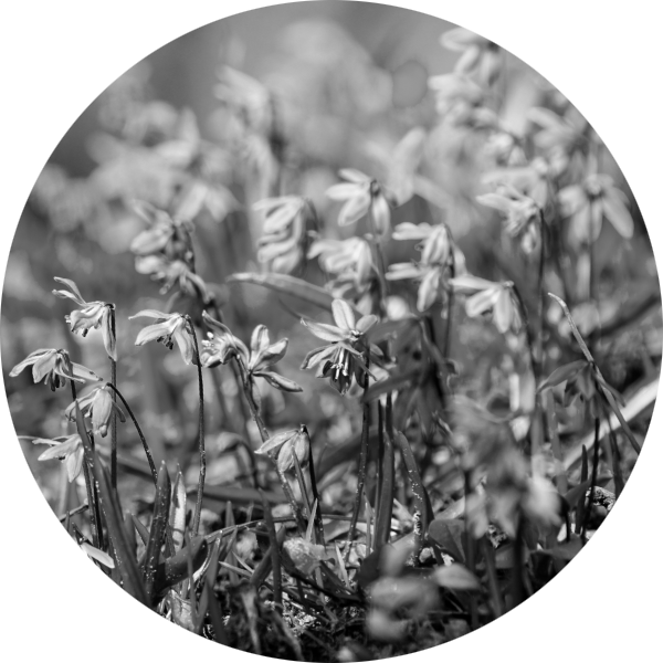
Our new branding therefore developed from a bluebell photo I took on a bike ride. Even though my brief was to avoid blue!
I’m often inspired by nature, so I put the image into a colour palette generator. To me, pink stood out. It felt friendly, fresh, and vibrant – how we saw Redox.
As hardened Liverpool fans, Nathan and Tom originally chose red for Redox. Now we wanted to shake this up in our own way.
We considered countless shades of pink and challenged it with radical alternatives. But nothing else aligned so well with our business personality: warm and friendly, lively and fun.
Of course, colour choice is subjective. Personally, I feel red can be aggressive and often used for warnings. Blue feels corporate – something we wanted to avoid. We considered purple briefly too, but it was too much on the eye. So, pink it was.
Teamed with carefully chosen greys – often seen in technology branding – the Redox personality had now burst into colour.
Perfecting brand guidelines.
Developing brand guidelines from the outset (when not already available) enables consistent branding across your business. Depending on your organisation, a few pages will suffice.
As we worked up our new branding, I created the guidelines. It’s an iterative process and they’d ultimately guide the team on every use of our brand. Email signatures, social media, and PowerPoint presentations, for example, would all align.
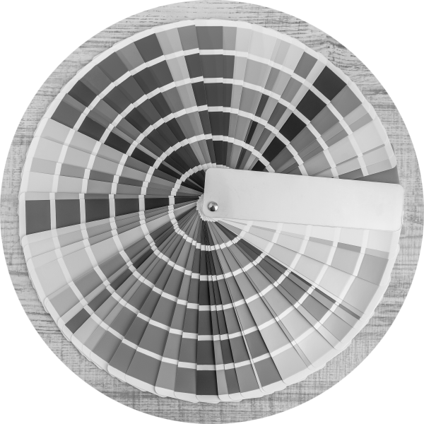
First, I documented our chosen colour palette. Not just primary colours, but secondary and tertiary too.
This would fuel accent colours – used in charts and graphics, for example.
I then focused on typography. Refreshing the logo, I also documented which font sizes and weights to use in various locations.
Documenting application examples (such as graphics and letterheading) clarified how this would come together.

Catching your eye.
Like every good website design, I started with old-fashioned pencil and notepad. From here, we generally move into user interface design software such as Figma. This provides a more realistic, interactive design for review.
My scribbles suggested a strong design pathway for our new website. So, I decided to discuss this with Nathan and Tom before considering alternatives. They loved it.
When designing websites, I like working with a structured grid, then breaking it in places. This subconsciously interrupts your reader, drawing their eye to key areas. Essentially, it creates a more engaging design.
Using this approach for Redox, round images spill out of the grid whilst other aspects catch your eye as they break the mould. Using a less regimented approach reinforces our character, too.
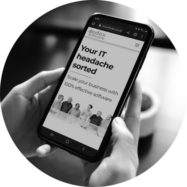
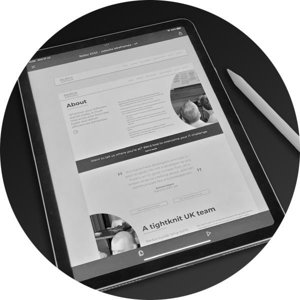
I always develop a new website design for one page first. We review this together before moving on. It accelerates the process because we never go too far in the wrong direction. For Redox, I started by designing our About page in Figma.
A clean design with a monochrome feel, it leans heavily towards today’s trends. Our pink adds that splash of vibrance and supports our character nicely.
Once we’d finalised the About page in Figma, I developed each page in the same way.
Sky Sports inspiration.
My ideas often come from the least expected places and that was the case for our team page.
Many team structures are stale or overused. I wanted to find something fresh and fun.
That’s when I remembered Sky Sports. Ahead of the match, they used to introduce each player with a little ‘walk on’ moment before placing their image on the pitch. I loved that movement. It kept your attention and delivered more personality.
Creating a proof of concept (deliberately using a Liverpool player image), I pitched it to Nathan and Tom. They agreed it was a great way to go.
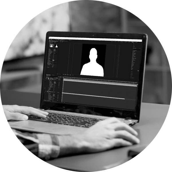
Whilst simple to view the animation it was complex to create. I used a green screen at our team away day and took almost 1,000 photos. I also shot each team member walking a short distance. Then, in post-production I put it all together.
Each person’s image sits in the circle. On scrolling, a short video plays. Often, they move out of the circle before finishing with the image again.
It’s such a small movement yet it shows a little of everyone’s personality. Another reminder of our fun, informal character. The result is seamless and it’s my favourite part of the website.
It will also be relatively straightforward to add new team members due to how I created the animations – even when they’re working remotely.
Conversational and plain English.
We’re not copywriters so we forged a partnership with an excellent one to help us create our relaxed, plain English style. So now, our words blend into the design – one reinforcing the other.
People don’t want to read about what we do, they want to understand how we can help them achieve their goals.
They want to feel confident we’d be the perfect partner for them.
So, that’s exactly what our messaging focuses on. We’ve avoided excessive tech-speak and focus on what our website visitor wants.
Tell us what you think…
Now you’ve experienced our brand-new website and branding, we’d love to hear what you think.
We’re delighted to have a website that finally fits with our skills, personality, and values.
As Redox continues to evolve and grow, we’ll keep a close eye on our website. We won’t let it become so out-dated again.
Could we help with your website development, so you become proud of your online presence? Please get in touch if you’d like a chat about it.