What makes a successful website in 2022?

You have seconds.
These days our attention spans are alarmingly low. With intense competition for our time, people typically view a website for seconds before deciding whether to read on or leave. We want answers NOW and we don’t want to work for them.
Your site must be fast, easy to use, and deliver pin sharp messaging.
The situation isn’t helped by everyone expecting Amazon-style user experience from every website, even if you’re a small business or in the B2B sector. We’re our own worst enemy, demanding high standards and scorning businesses that get it wrong.
Then, there’s Google. Always changing the goal posts with countless algorithm changes, your website can be here today and lost in the search results tomorrow. Even specialists have a hard time keeping up with Google and what it wants from a website.
One important shift in 2022: Google only crawls the mobile version of websites. So, if a feature doesn’t work on your mobile site, Google won’t rank that page.
And websites date quickly. You’re soon behind the times if you’re not constantly scanning the horizon. A dated website detriments your image to the outside world too.
Package all this together and it’s a wonder anyone can create a successful website today.


The value of clarity.
Creating a successful new website is a mammoth task. Especially when it affects many departments. For example, marketing, logistics, and IT will have different objectives. And that’s all before you’ve considered the end-user.
Don’t rush into design and build. A successful website starts with many detailed conversations. This is where we start every website project – it always reaps huge rewards.
Who’s your target audience?
It’s crucial you understand your ideal website visitor. Think beyond demographics such as age, gender, and location.
- What do they want from your website?
- Where will they view it (at home or in the office, for example)?
- Are they a consumer or a businessperson? (Mindsets will differ)
- How important is accessibility to your audience?
- How IT literate are they
If you don’t have the answers in-house, take time to get them. Talk to customers and consider what works (and doesn’t) on your current website.
What are your core website objectives?
Every department or role with an interest in your website will have a different objective. And yet, a committee never creates a successful website.
Talk to everyone at the outset. Get clarity and tackle potential conflicts early on. Gather plenty of thoughts and ideas, then ensure you move forward with a clear picture of your key goals.
This is when to clarify your design guidelines too. Your logo, colour palette, fonts, and style guides. Early website designs will be far more realistic when your website builders have this to hand.
The right design tools.
At Redox, we prioritise thorough user interface (UI) design. We’ll develop and adapt many design and structure ideas before writing a single piece of code.
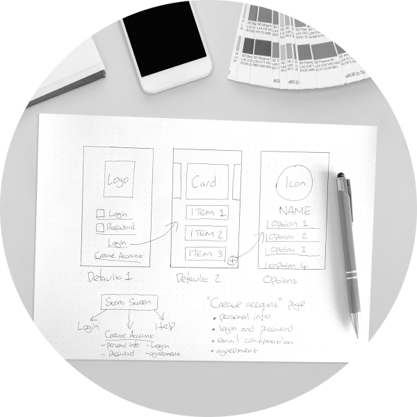
You can’t beat starting with a pencil and paper. Even in 2022, the basics count.
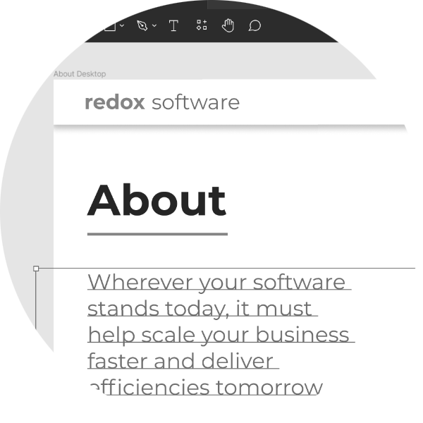
From there, we create polished and interactive mock up designs using various software tools. This gives clients a clear picture before making important choices ahead of the build.
Balsamiq is a simple user interface design tool offering many pre-built functions. It’s quick to use and enables effective wireframing for websites and apps.
Another favourite at Redox is Figma. Immensely intuitive, this tool transforms a flat design into an interactive prototype. It feels more like the real thing, supporting early buy-in from various stakeholders.
Figma is also an ideal choice when more than one designer is working on your website. They can collaborate in real time, wherever they are.
There’s a wide choice of UI design tools. And what works for one, might not for another. Choose a website partner who’s familiar with many. That way you get more from your early ideas.
As for coding, we never start until the design is final. Once approved, we create a perfectly functioning website using bespoke code. It’s the same when building administration sites too.
You can’t beat building from the ground up. Treating websites like building software, your back-end achieves a much longer service life, whilst you’re free to refresh the user interface more frequently.

Mobile first.
There’s no doubt more users are viewing websites on mobile devices. Sources vary but research suggest that global mobile website traffic share has grown from 10.88% in 2012 to 58.26% in 2022 (source: oberlo.co.uk).
Of course, that varies by business sector. And B2C will attract more mobile traffic than B2B. But in 2022, NO business can ignore the dominance of mobile website browsing.
Google knows this, which is why it only crawls mobile websites now. So, a successful website today puts mobile first.
This causes questions when it comes to complex elements such as large tables of data or long PDFs. Do you enable them for mobile, so Google ranks them, but risk impeding the user experience (UX) in the process?
There’s usually a common-sense answer. We always help our clients with this on a case-by-case basis.
And whilst nobody likes to scroll on a desktop, it’s inevitable on a mobile device. That said, you should always place your most important messages and content at the top of every page. Let them find it in seconds.
2022 website design trends.
Every few years websites move on. Trends typically start with leading and luxury brands. Names like Apple, Aston Martin, and Bremont watches. Leading fashion brands are influential too. They steal the march and try new things, always looking to perfect their user experience.
Whatever your sector, fuel your inspiration by looking broadly at trendsetters.
In 2022, website design is about simplicity without looking basic. Highly functional websites look easy to use. It’s an intuitive experience, taking pain away from the user. They turn up and know exactly what to do.
This current trend is hard to balance perfectly. Yet when you do, your website will stand out from the masses.
Black and white
Silver used to be the ‘in’ colour. Recently, orange and blue have been widely used. Whilst these worked, everyone started to look the same.
Today, we believe the leading trend is black and white with spot colour accents. It’s come from the fashion world where products provide the splash of colour. Many leading logos are reverting to black, too.
Choosing your colour palette might depend on other factors, though. Consider medical businesses, for example. Consumers expect them to sport a blue and white colour palette. And plant-based foods would be mad not to embrace green.
Colours must fit your business culture too. Corporate brands often lean towards blue, considered trustworthy and stable, whereas brighter colours inject more fun into your character.
When refreshing the Redox website, we chose pink as our spot colour. The site has a high-quality feel to reflect our work, freshened with a splash of pink to express our individuality.
Perfect your imagery
Visual cues form part of your successful website. Even the best designed website will falter when images are compromised. In 2022, people expect high quality.
Animation and illustration cheapen everything unless executed well. Moving animation also presents challenges as many choose to disable moving elements on a website. Should you animate key statistics, for example, your message could be lost.
Gone are the days of stock illustration – it’ll quickly date and drag your site down. In fact, library images and stock photography won’t help your website succeed today. It’s inevitable you’ll use a photo that quickly crops up on other websites. And stock images with people in risk an inconsistent style.
Far better to embrace your imagery and do it properly. Take your own photos (using a professional or accomplished photographer) and own your consistent image. Ensure they’re crisp and size them appropriately to optimise speed and user experience.
Accessibility
Many businesses continue to overlook website accessibility. Don’t take this risk when creating a market-leading website in 2022.
Maybe you feel the probability of a colourblind person looking at your website is low. You might feel your audience is young and unlikely to have visual impairments.
But you’re missing a big point.
Google pays attention to accessibility now, so you should too. It wants to provide the best, most inclusive experience. Before long, Google will prioritise accessible websites. Rightly so.
To create the most successful website, you must invest in accessibility functionality. Morally and commercially it’s the right thing to do.
The right message
Think carefully about your words. Great websites don’t just look good and work well, they read well too.
With rock bottom attention spans it’s vital to engage your visitor from the outset. To do so you must understand your audience inside-out.
- What’s going on in their world?
- What are their challenges?
- Where are they expecting you to come in?
Focus your messaging on them, not you. They want to know how you can help them. They want to discover the outcome you deliver – in words they relate to.
As for SEO, write for your reader first, Google second. In fact, nobody wants to see keyword stuffed copy – not even Google.
Instead, create well-written, naturally flowing, conversational copy. This is what Google’s algorithm rewards in 2022.
Many website companies are playing catch up here. They’ve focused on keywords at the expense of everything else.
But consider this: when you write copy that engages your audience (because you know them well) you naturally use relevant keywords anyway. Plus, because they’re more likely to read your compelling message, they stay on your website longer.
All this increases dwell time and reduces your bounce rate. Great news for Google ranking performance.

Quality wins in 2022.
Cutting corners when creating a website will come back and bite you later. With such a rapid pace of development a successful website must be at the forefront from every angle – user interface, design, branding, and messaging.
Just one word of warning: make sure your audience can keep up with you. With so many browser versions in action, prevent alienating visitors by building backwards compatibility.
Your audience should be front and centre of everything you do. After all, you’ve achieved little if they leave your site within seconds.
Website design is complex and forever changing. That’s why we do a proper job – from first pencil sketch to successful launch. Should you want to chat about creating your successful website in 2022, please get in touch.
Recent Posts
- The real cost of offshoring: Why UK companies are bringing software development back home
- Of heartstrings and algorithms: Music in the age of AI
- The heart-in-a-bucket problem: Why AI fails in organisations
- From a nudge to a sledgehammer: How AI’s gloves are off
- The hidden costs of poor UX: Why software interfaces matter more than you think
